
I'll just leave these here, food for thought Gallop.


I'll just leave these here, food for thought Gallop.
Originally Posted by Grimario


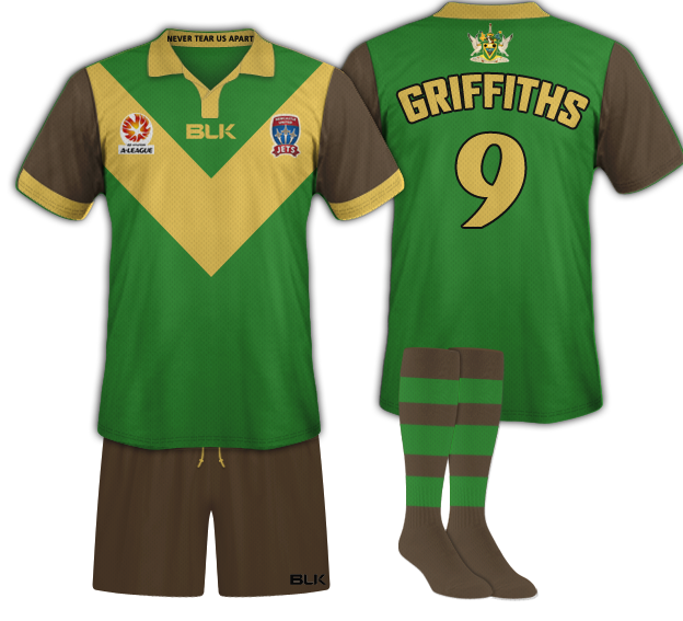
Emerald at home. Gold away

Replace "Hunter Ports" with whoever our new major sponsor is, and you're onto a winner Pico

pretty sure the email said the name, colours and logo will remain the same

It said "as existed in the past". Both gold, and E&C, have existed in the past.
You gotta pick up on these journo ways of being extremely vague and general without ever fully locking yourself into stuff.
OK
as a budding journalist, the key word in that sentence was "retain"
"as existed in the past" was just used because they can't say "for the last 10 years"

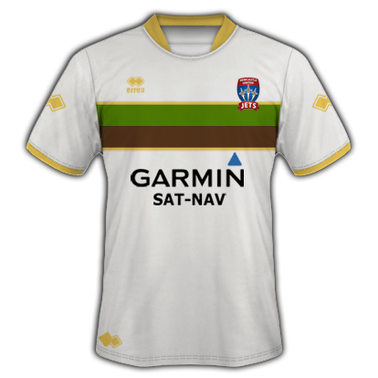
Any chance someone with expertise in the area of photoshop would be able to change the white in this to Gold to see how it looks, tah.

Went for the gold for Home but definently Emerald and cinnamon for the away, specifically the one above with the bar stripes.
Classy, undrrstated and wouldn't look like the Trollope rolled out the last two seasons.
Last edited by Rocknerd; 22-05-2015 at 08:47 AM.
Todd has obviously made the KB one for Newy Football History, and it looks so freaking good.
A few years back, goaliepersempre got a few of the bottom ones made up as replicas. I still have mine, and I absolutely love it. Would love for our guys to be playing in it tbh.
OK
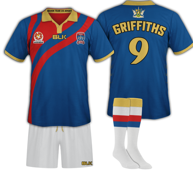
By just changing the colours slightly the red and blue combines much nicer, the blue is more in line with the kit we had under con, probably one of my favourites, the gold and red look so good on the darker blue.
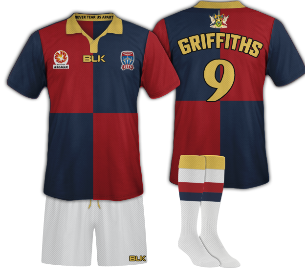
An attempt to use the symbolism of the Newcastle crest in the strip, probably too close to victory though.

The gold, blue and red one is absolutely brilliant. I love that more than any jets shirt I have. To tell you the truth, I love it more than any shirt I have!
Unfortunately I find that emerald one pretty hideous. Like the idea and meaning behind all of those colours but just don't think they go together.
WE DON'T DO WALKING AWAY !

If the Gold on the second kit was White I think we would have a winner.
My ideal Kits would be a return to Gold for the Home and a proper KB inspired kit with the Horizontal Stripes for the Away.


The Blue and Red one is now nothing more than a copy of Barca's
To say it looks better is bullwhip.
You have just copied a well known kit and then threw a jets badge on it
anything but gold
Pink with purple polkadots?
this

It'll be gold...

Just use the KB colour scheme for home and away. Let's move on from gold.
I used a similar kit template to a previous kit we have used, as it is easier for people to compare.
Yes strangely barca do use darker hues of red and blue, I wonder why, perhaps to avoid the retina scaring nature of bright royal blue and a bright red.
But just for you as you seem to be having trouble looking beyond the kit template I used, here is another comparison where I believe the same darker colours combine much nicer with the gold.
Pretty neck and neck with either Gold or Emerald/Cinnamon.
Also unanimous that overwhelming majority do not want to retain the Red/Blue which were forced on the club by HSG without any consultation with Members.
 Posting Permissions


 Reply With Quote


