Page 27 of 95 FirstFirst ... 1725262728293777 ... LastLast
Results 521 to 540 of 1898

Thread: Reebok can still gtfo - A-League Kits Thread

  1. #521
    Senior Member leftrightout's Avatar
    Join Date
    Jun 2012
    Posts
    2,429
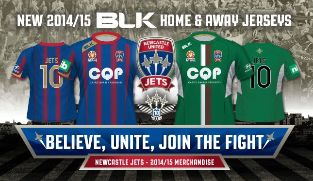
    I quite like both of them. I think the away strip is even better than last season.
    Like PV4, i will wait to make full judgement until i see them on, but first impression is a pass.

    I understand what people say about the red patch but what other options are there?
    Stripe shirts would be hard to design with a number on the back. If they went with blue background everyone would probably complain that there is too much blue.
    WE DON'T DO WALKING AWAY !

  2. #522
    Senior Member Premy's Avatar
    Join Date
    Nov 2012
    Posts
    3,863
    Can someone with mad photo shop skills make the middle blue strip gold to see how it would look? Please.
    Quote Originally Posted by #fixsmithpark View Post
    I'M GULLIBLE!

  3. #523
    aka WLG pv4's Avatar
    Join Date
    Jun 2012
    Posts
    7,466
    Quote Originally Posted by Premy View Post
    Can someone with mad photo shop skills make the middle blue strip gold to see how it would look? Please.
    Would make the kit too busy IMO
    OK

  4. #524
    brutally rapes small, cute dogs parksey's Avatar
    Join Date
    Jun 2012
    Posts
    2,336
    look ok to me.

    seeing them in person will be the real test.
    Quote Originally Posted by snake View Post
    bridges made the world in 6-8 wks

    he then rested by the corner flag and all was gud
    Quote Originally Posted by Phil Stubbins
    Hopefully it’s the four players, but, if not, the three, and if not, the two.
    Quote Originally Posted by Maito Mitch View Post
    Do you ever get bored of sprouting the same old crap? You're about as predictable as the punishment on the field we sit through once a week

  5. #525
    Senior Member
    Join Date
    Jun 2012
    Posts
    7,391
    Quote Originally Posted by Premy View Post
    Can someone with mad photo shop skills make the middle blue strip gold to see how it would look? Please.
    Mad skills? I do all my work in paint, that's how mad my skills are.


  6. #526
    Senior Member Premy's Avatar
    Join Date
    Nov 2012
    Posts
    3,863
    Quote Originally Posted by Grimario View Post
    Mad skills? I do all my work in paint, that's how mad my skills are.


    Haha gold I would buy this in a heartbeat.
    Quote Originally Posted by #fixsmithpark View Post
    I'M GULLIBLE!

  7. #527
    Senior Member
    Join Date
    Jun 2012
    Posts
    1,209
    Quote Originally Posted by pv4 View Post
    Can't say I'm a fan of the home, the back looks awful. The away is a pass.
    But saying that you really need to wait to see what it looks like in the flesh.

    Agree with the whole releasing kits as photoshop images, a bit amateur hour, compare that reveal to the city reveal...

    I do like the nice touch of using the gold in the blk logo, would be interested to see what the sponsor logo looked like in gold too.
    Quote Originally Posted by Grimario View Post
    Harper just described our play as constipated. Perfect description of our slow movement that goes nowhere and of our coach who is full of shit.

  8. #528
    Senior Member
    Join Date
    Jun 2012
    Posts
    7,391
    Quote Originally Posted by pv4 View Post
    Would make the kit too busy IMO
    I think if you get rid of the horrible BLK on the shoulder, it would look decent.

  9. #529
    aka WLG pv4's Avatar
    Join Date
    Jun 2012
    Posts
    7,466
    Quote Originally Posted by Pico View Post
    would be interested to see what the sponsor logo looked like in gold too.
    I (and I'm pretty sure you) have been saying this since the first Hunter Ports logo!! Too true my man.
    OK

  10. #530
    Senior Member
    Join Date
    Jun 2012
    Posts
    1,209
    Quote Originally Posted by pv4 View Post
    I (and I'm pretty sure you) have been saying this since the first Hunter Ports logo!! Too true my man.
    At least they have a solid neutral colour unlike the victory ended up with.

    Ironically have a look at the standard CQP logo.....


    Quote Originally Posted by Grimario View Post
    Harper just described our play as constipated. Perfect description of our slow movement that goes nowhere and of our coach who is full of shit.

  11. #531
    Senior Member leftrightout's Avatar
    Join Date
    Jun 2012
    Posts
    2,429
    Quote Originally Posted by Grimario View Post
    Mad skills? I do all my work in paint, that's how mad my skills are.


    Quote Originally Posted by pv4 View Post
    Would make the kit too busy IMO
    Got to agree, makes it look way to busy. Starting to look more like a rugby league shirt with that much going on
    WE DON'T DO WALKING AWAY !

  12. #532
    in awe of baz GazFish35's Avatar
    Join Date
    Jun 2012
    Posts
    6,421
    the home strip looks like they are in a cage. Seems they are ainming for the active suport look.


    I like the away kit.


    ui would jizz my pants if we ever went for a harlequine red/blue option.

  13. #533
    in awe of baz GazFish35's Avatar
    Join Date
    Jun 2012
    Posts
    6,421
    CQP owned in part by Tinkler apparently.

  14. #534
    Senior Member
    Join Date
    Jun 2012
    Posts
    7,391
    Quote Originally Posted by leftrightout View Post
    Got to agree, makes it look way to busy. Starting to look more like a rugby league shirt with that much going on
    Too busy, indeed.

    Why the **** do companies struggle with vertical stripes? It's not like gold numbers with a white outline bends in too much with red and blue, FFS.

    Dodgy copy/pasting aside, what exactly is wrong with this?


    Sort it out, BLK. Won't be buying one and all I can say is Bad Luck, Kuntz.
    Last edited by Grimario; 15-07-2014 at 02:55 PM. Reason: Took out the gold stripe front bit

  15. #535
    brutally rapes small, cute dogs parksey's Avatar
    Join Date
    Jun 2012
    Posts
    2,336
    back looks a lot better.
    Quote Originally Posted by snake View Post
    bridges made the world in 6-8 wks

    he then rested by the corner flag and all was gud
    Quote Originally Posted by Phil Stubbins
    Hopefully it’s the four players, but, if not, the three, and if not, the two.
    Quote Originally Posted by Maito Mitch View Post
    Do you ever get bored of sprouting the same old crap? You're about as predictable as the punishment on the field we sit through once a week

  16. #536
    Senior Member
    Join Date
    Jun 2012
    Posts
    1,209
    Quote Originally Posted by Grimario View Post
    Too busy, indeed. Ignoring the front gold stripe (because, for some reason, I decided to edit the already edited pic instead of the original)... why the **** do companies struggle with vertical stripes? It's not like gold numbers with a white outline bends in too much with red and blue, FFS.

    Dodgy copy/pasting aside, what exactly is wrong with this?


    Sort it out, BLK. Won't be buying one and all I can say is Bad Luck, Kuntz.

    back looks so much better.

    Provided the number has a bold font there is no reason to need a stupid large block out panel. A bit of care with the size and positioning of the stripes is all that is needed too.
    Quote Originally Posted by Grimario View Post
    Harper just described our play as constipated. Perfect description of our slow movement that goes nowhere and of our coach who is full of shit.

  17. #537
    Senior Member leftrightout's Avatar
    Join Date
    Jun 2012
    Posts
    2,429
    That back does look better than the real one...
    WE DON'T DO WALKING AWAY !

  18. #538
    Senior Member
    Join Date
    Jun 2012
    Posts
    7,391
    Quote Originally Posted by Pico View Post
    back looks so much better.

    Provided the number has a bold font there is no reason to need a stupid large block out panel. A bit of care with the size and positioning of the stripes is all that is needed too.
    Yeah, even then I can't really see any combination of the red and blue on the back that would make gold with white outline hard to read.

  19. #539
    Senior Member
    Join Date
    Jun 2012
    Posts
    17,380
    shouldve just given the jersey design to you guys, 5mins & some common sense, win

  20. #540
    aka WLG pv4's Avatar
    Join Date
    Jun 2012
    Posts
    7,466
    EXCUSE THE SHOTTY PAINT JOB

    Taken Grim's back idea.

    Made CQP gold on home jersey.

    Moved cinnamon&white stripe to the side.

    IMO this is what we should have:

    OK

Posting Permissions

  • You may not post new threads
  • You may not post replies
  • You may not post attachments
  • You may not edit your posts
  •