


Originally Posted by Grimario

back looks so much better.
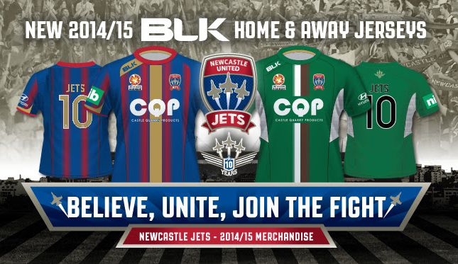
Provided the number has a bold font there is no reason to need a stupid large block out panel. A bit of care with the size and positioning of the stripes is all that is needed too.


back looks so much better.
Provided the number has a bold font there is no reason to need a stupid large block out panel. A bit of care with the size and positioning of the stripes is all that is needed too.
 Posting Permissions

 Reply With Quote